Color Psychology in Interior Design
Unlock the emotional power of colors to create moods, influence behavior, and elevate your home’s design.
Color Psychology in Interior Design:
How Colors Transform Your Space
What is Color Psychology?
The study of how colors affect human emotions, mood, and behavior. In interior design, colors can make spaces feel cozy, energetic, or serene.
Why It Matters
90% of first impressions about a room are based on color (Pantone Study).
Colors can alter perceived room size (light vs. dark).
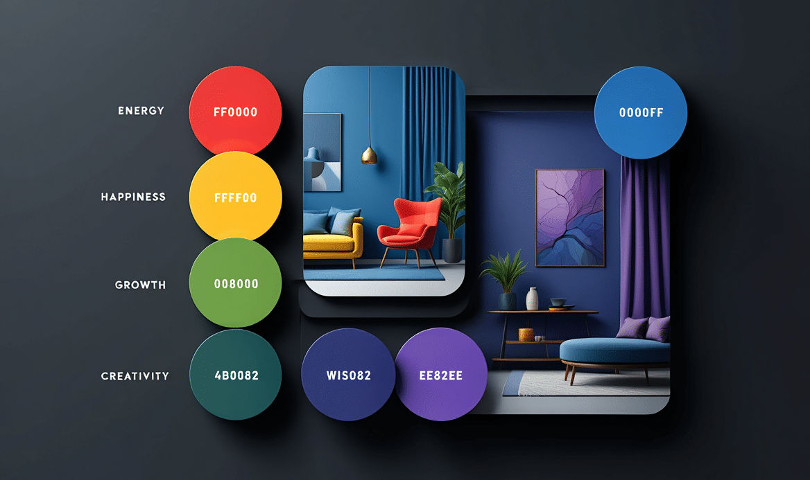
Color Categories & Their Effects:
A. Warm Colors (Reds, Oranges, Yellows)
Emotions: Energy, warmth, excitement.
Best for: Dining rooms (stimulates appetite), social spaces.
Example: Terracotta walls in a Mediterranean-style living room.
📸 Image: A cozy orange-toned lounge with a caption: “Warm colors promote conversation.”
B. Cool Colors (Blues, Greens, Purples)
Emotions: Calm, relaxation, focus.
Best for: Bedrooms, home offices, bathrooms.
Example: Sage green kitchen for a natural vibe.
📸 Image: A serene blue bedroom with soft lighting.
C. Neutrals (Whites, Grays, Beiges)
Emotions: Balance, sophistication.
Best for: Small spaces, minimalist designs, backdrop for art.
Pro Tip: Use texture (linen, wood) to avoid sterility
Room-by-Room Color Guide:
| Room | Recommended Colors | Psychological Effect |
|---|---|---|
| Bedroom | Soft blues, lavenders | Promotes sleep & relaxation |
| Home Office | Greens, muted yellows | Enhances focus & creativity |
| Kitchen | Warm reds, creamy whites | Stimulates appetite |
| Bathroom | Spa-like blues, whites | Feels clean & serene |
2025 Color Trends with Psychology
Peach Fuzz (Pantone’s 2024 Color): Gentle warmth for nurseries or reading nooks.
Earth Tones: Grounded, organic feel (think clay, ochre).
Dark Academia: Deep greens/browns for a cozy, intellectual vibe
Cultural & Personal Color Meanings
- Cultural Differences:
White: Purity (West) vs. Mourning (East Asia).
Red: Luck (China) vs. Danger (USA).
- Personalization: Use color quizzes to find your palette.
How to Test Colors in Your Space
Paint Samples: Test swatches at different times of day.
Digital Tools: Use apps like Sherwin-Williams ColorSnap.
Lighting Matters: Warm light enhances reds; cool light sharpens blues.
Common Color Mistakes to Avoid
❌ Ignoring natural light (colors shift throughout the day).
❌ Overstimulating small spaces with dark hues.
❌ Clashing undertones (e.g., warm gray with cool white).
Conclusion: Harness Color Like a Pro
- Start with a mood board to visualize combinations.
- When in doubt, consult an interior designer for a custom palette.